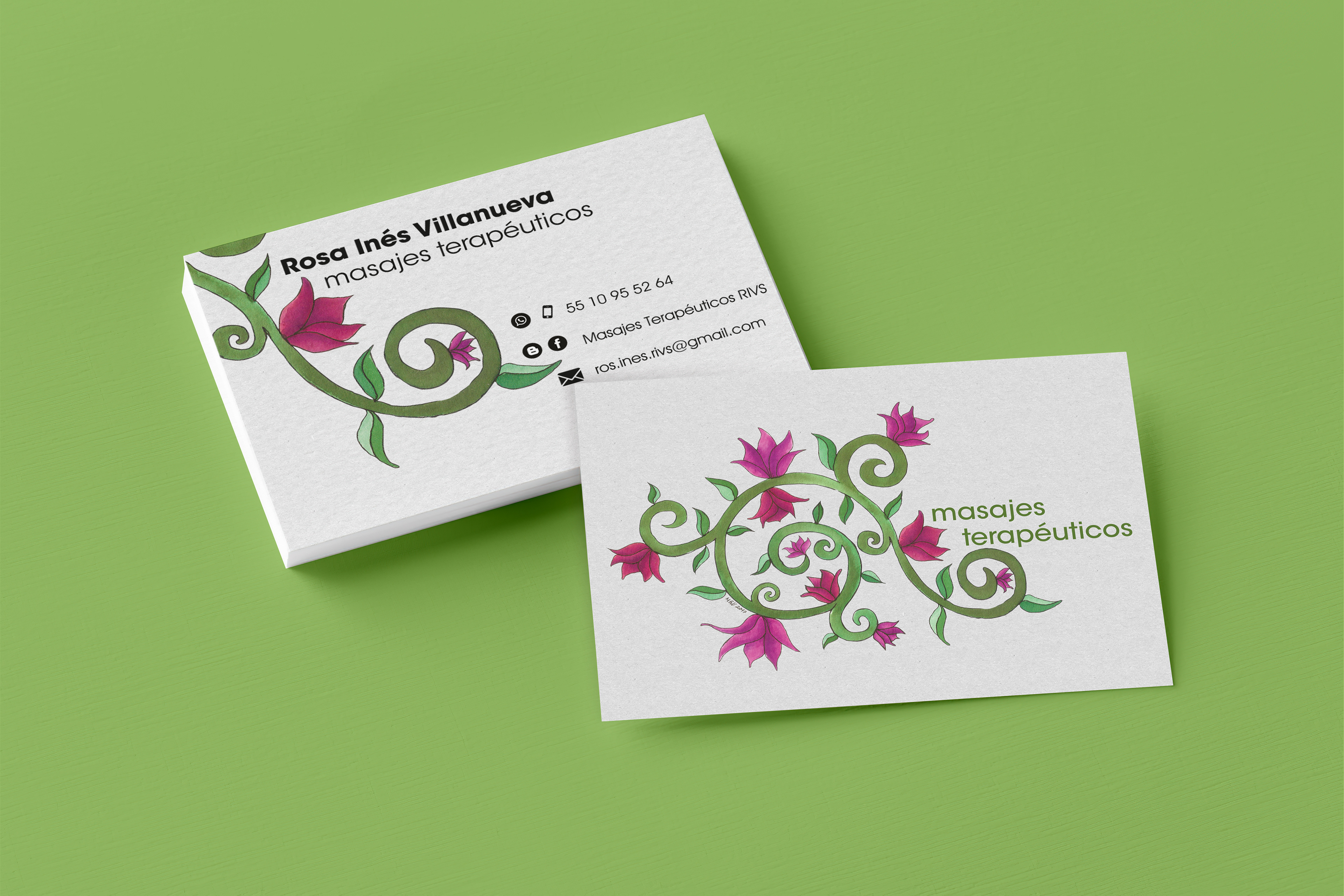
Rosa Villanueva es una terapeuta (masajes) estaba buscando una identidad como profesional independiente para colocarse en el campo laboral, contando con gran preparación espiritual y en diferentes técnicas de masaje siempre busca conectarse energéticamente con el cliente para generar una experiencia nueva y maravillosa.
Rosa no estaba buscando el típico icono minimalista, quería algo que la representara aún más con conceptos como el árbol de la vida, la espiral, el trisquel, el fuego violeta, entre otras ideas con gran significado para ella.
Rosa Villanueva is a masseur looking for an identity as an independent professional with a lot of spiritual and technical preparation in different massage techniques, she always tries to connect at an energetical level with her clients to create a new and marvellous experience.
Rosa knew exactly what was she looking for, it wasn't the typical minimal icon, she wanted something that represents a lot of concepts like the tree of life, the spiral, the triskele, the violet fire, and other ideas with great meaning for her.
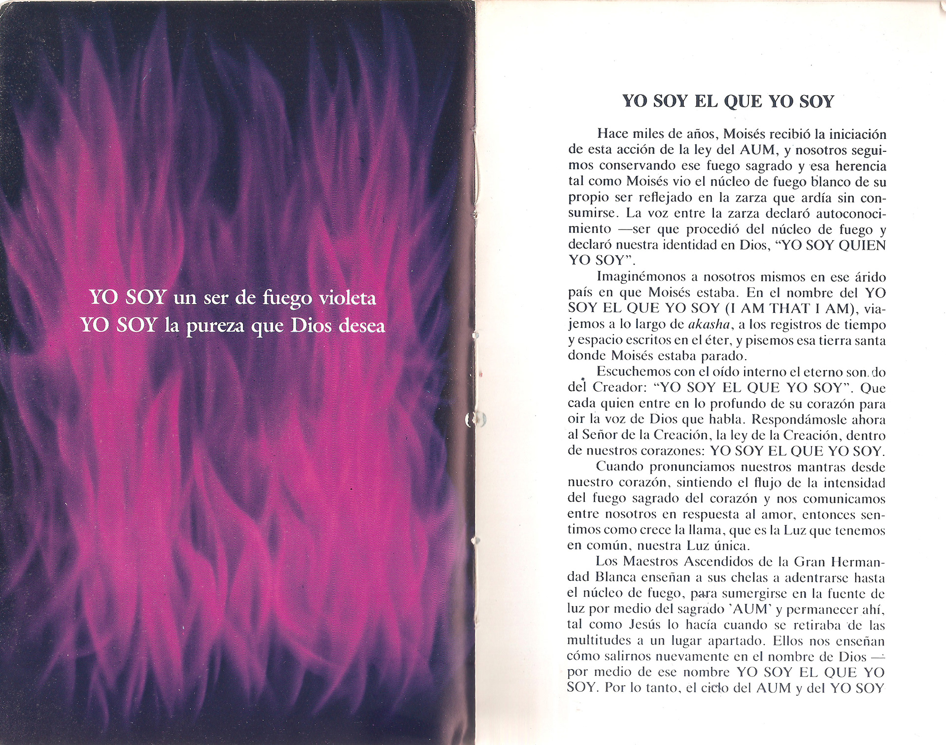
Texto de referencia e inspiración, fragmento de "La Ciencia de la Palabra Hablada" por Mark L. Prophet y Elizabeth Clare Prophet
Reference and inspiration text, fragment of "The Science of the Spoken Word" by Mark L. Prophet y Elizabeth Clare Prophet
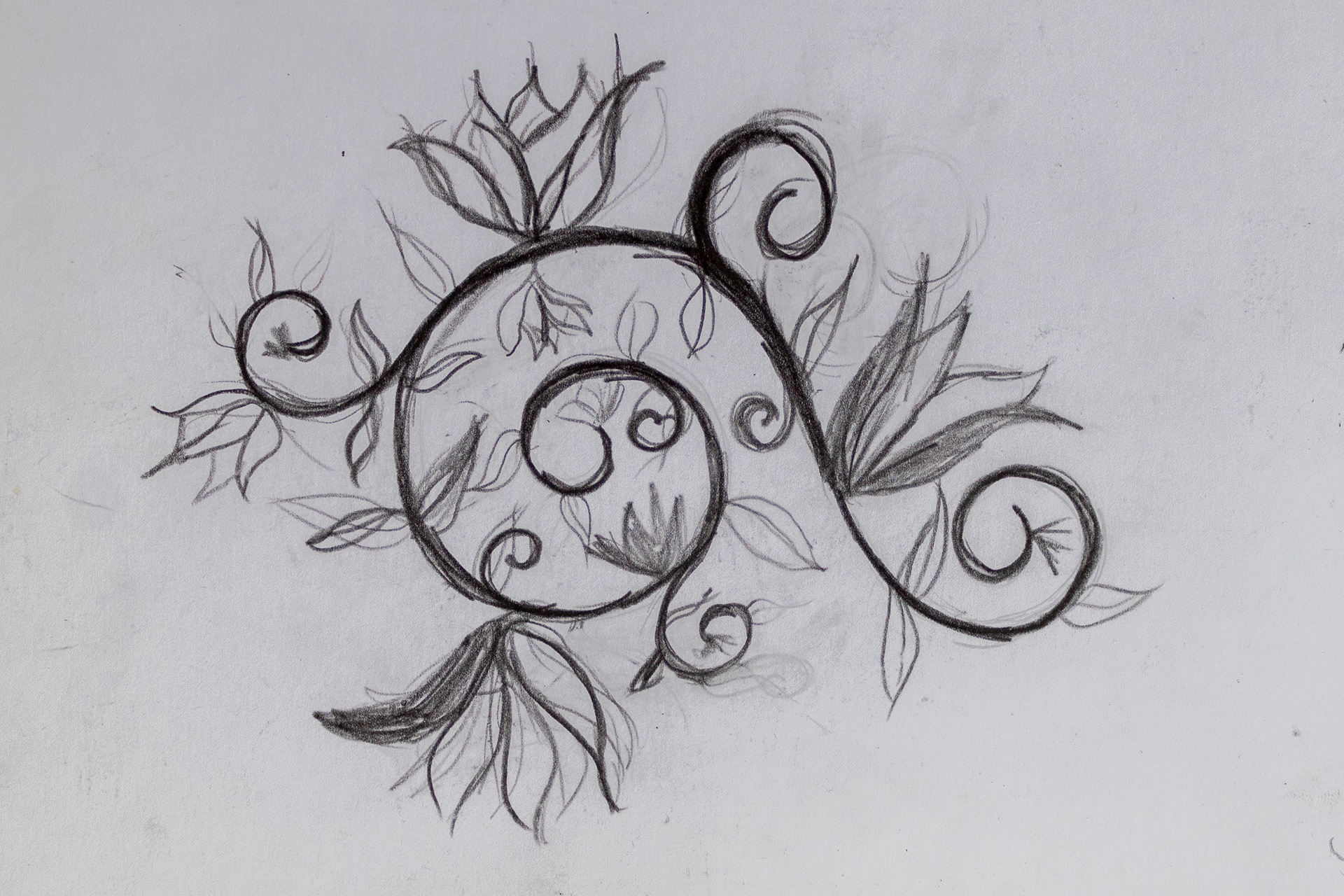
Primer boceto
First sketch
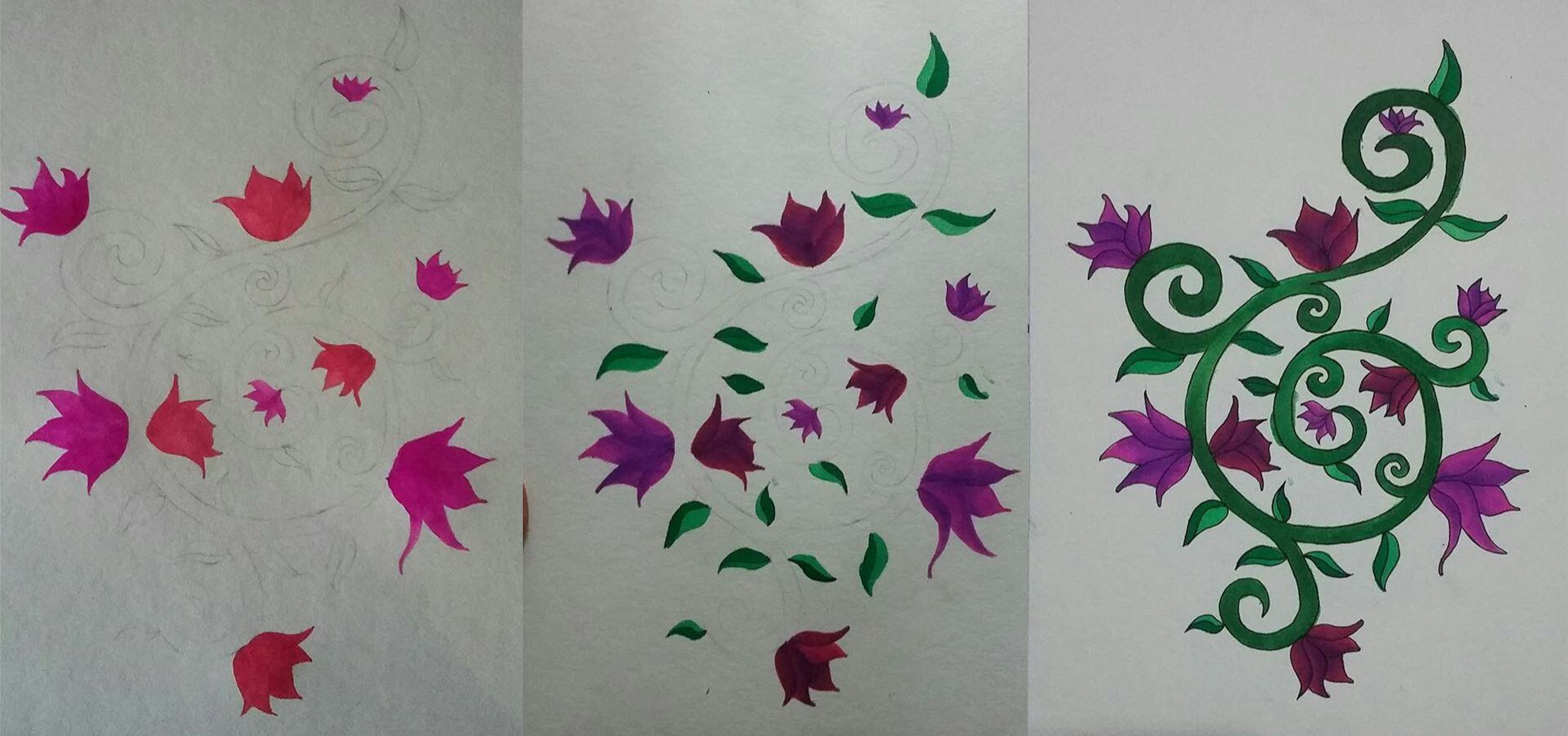
Proceso, añadiendo color
Process, adding colour
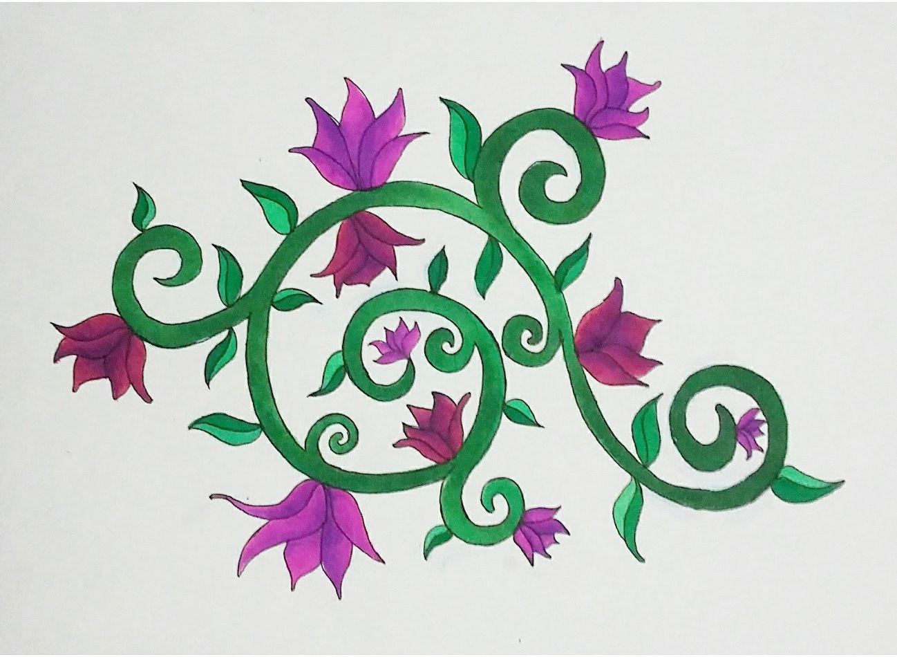
Ilustración final
Final ilustration
Es así como surge esta figura abstracta con doble esprial, en donde el verde hace referencia a la vida, al árbol de la vida, al bienestar; mientras que las flores rosas y violetas simulan el fuego violeta transmutador, cuya naturaleza puede generar un cambio a la esencia de las personas.
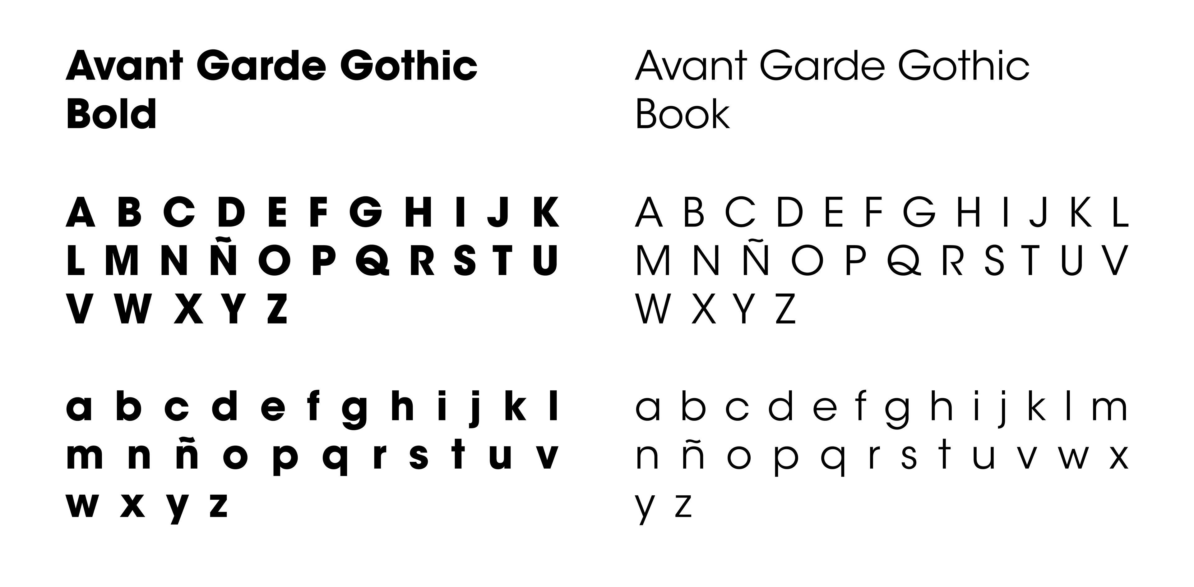
Además se usó Avant Grade Gothic, por ser una tipografía sin patines para hacerla más amigable.
That is how born this abstract figure with double spiral, where the green refers to life, the tree of life, wellness; meanwhile, the pink & violet flowers simulate the violet fire which has the power to transmute and has the power to make a change in the essence of the people.
Also, I used Avant Grade Gothic, because it is simple typography which makes everything a little more friendly.
Al ser una figura abstracta permite jugar con sus elementos y hacer uso de la sinécdoque para darle un aspecto diferente a su papelería.
Because it's an abstract figure it allows to play a lot with the elements and use the synecdoche to give it a different look to the stationary.